

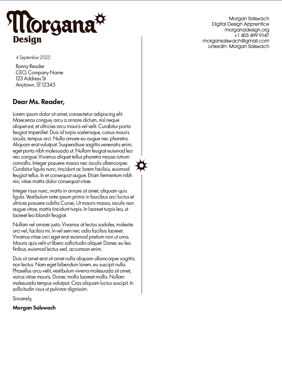


My designs for my personal brand, Morgana Design. As of November 24, 2025, this is still an ongoing project.
I am very much drawn to and inspired by Gothic and baroque styles. I love fantasy with all my heart, and I wanted to invoke that gothic style with a modern edge. The word-mark is actually a blend of two different typefaces, the "M" is part of a typeface called Gorgias, while the rest of the letters are from the "R41 Gotico" typeface. The body text of the letterhead is Futura 100, which I believe keeps that modern edge I was going for.
Since the font is black letter, I wanted to modernize it a bit by resting the type on a nice baseline, and wanted to convey motion and fluidity by rounding off some of the counters and hard lines of the type, and kerning the font. Overall, the most difficult part was trying to be subtle and letting the type speak for itself. The star-like motif was meant to convey the wheel of fortune, as I believe luck and fate play a substantial part in my life, whether good or bad.
Shown are a cover letter/letterhead template, the logos in both positive and negative colours, and the icon by itself, which will serve as supplemental imagery. As of Nov. 24, 2025, I have yet to decide on a personal colour palette, although I am leaning towards a maroon.