


The first sketches. Wanted to experiment with the idea of motion with a spaceship.

More thumbnails, experimenting with more fluid and spherical motifs.
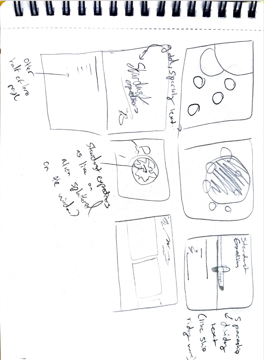
Expanding on the previous.

The final design after research and ideation.
This was a School Project where we were tasked with creating a 'Hero Section' for a fictional space luxury travel line called "Stardust Expeditions". The Hero section is the initial landing page of the website meant to catch the user's attention immediately.
By far the most challenging part for me in any project is the conception/sketching phase. It's difficult to not jump right into a project, and to force myself to really think, mull over every possible idea, and experiment when I am incredibly eager to start designing right away. However, as this project (and many others so far) have shown me is that it is an absolutely crucial step, and is now a vital part of my workflow.
I went through many different layout iterations, many experimental before settling on a more standard website layout, even researching other contemporary luxury travel sites. My reasoning was that while yes, I adore a flashy, experimental design, ultimately a website is for it's users, and if it is confusing to navigate, whats the point?
I settled for a centre-aligned layout, with two sections, one filled with the display type and necessary text, and the other with different tabs to click on for navigation, with a bold typeface and colour to provide clarity. I chose purple and gold for their connotations to royalty, luxury, and imagination.
In hindsight, I think a thinner, more sans-serif typeface would have suited the themes of luxury better, as my research into indicated.